Flight change
Help Expedia flight agents and customers easily change flights online, generating $5.5M in combined impact.
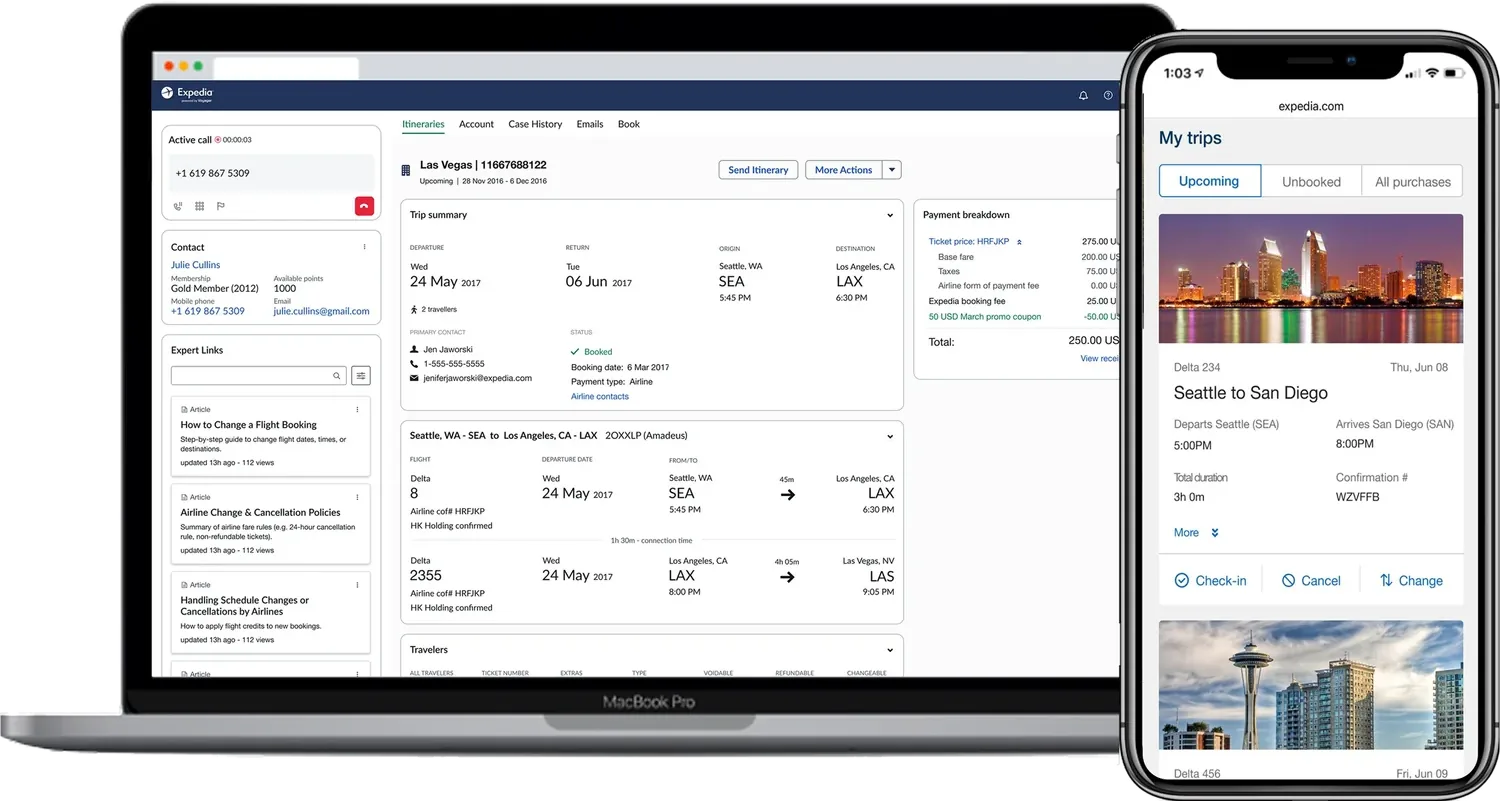
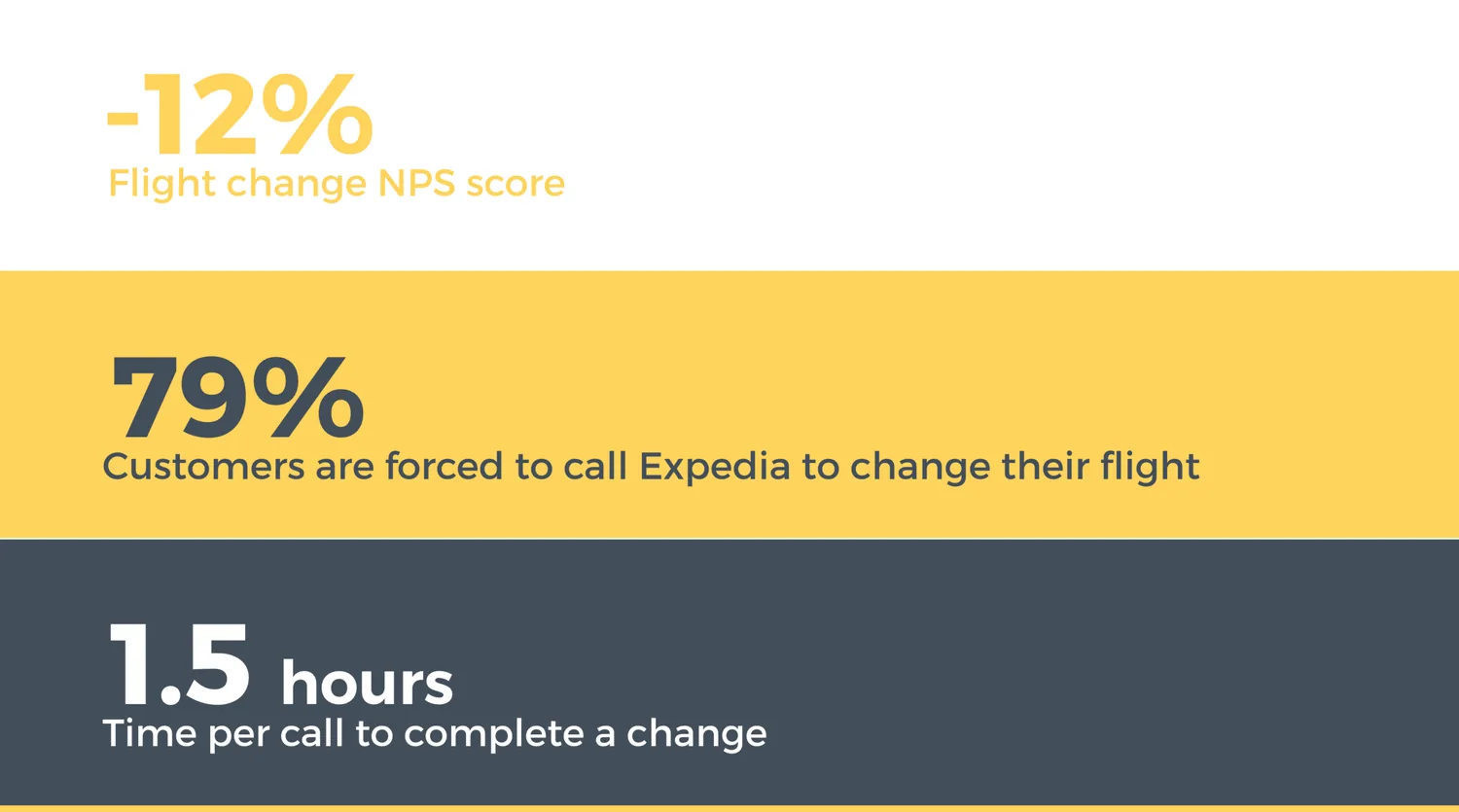
Calling a support agent was the only way Expedia's flight customers could exchange their flights — leading to frustrating phone calls that ran 1.5 hours on average and a poor change-flow NPS of −12%.
The business needed to reduce agents' average handle time, minimize operational and agent-error costs, and retire the Legacy Flights tool by building flight transactions on Expedia's Voyager platform (already used for lodging). The goal was two-sided: make the change experience fast and self-serve for customers and streamline the workflow for agents.
Agents were juggling tools; customers were flying blind
Interviewed agents on how they changed existing flights
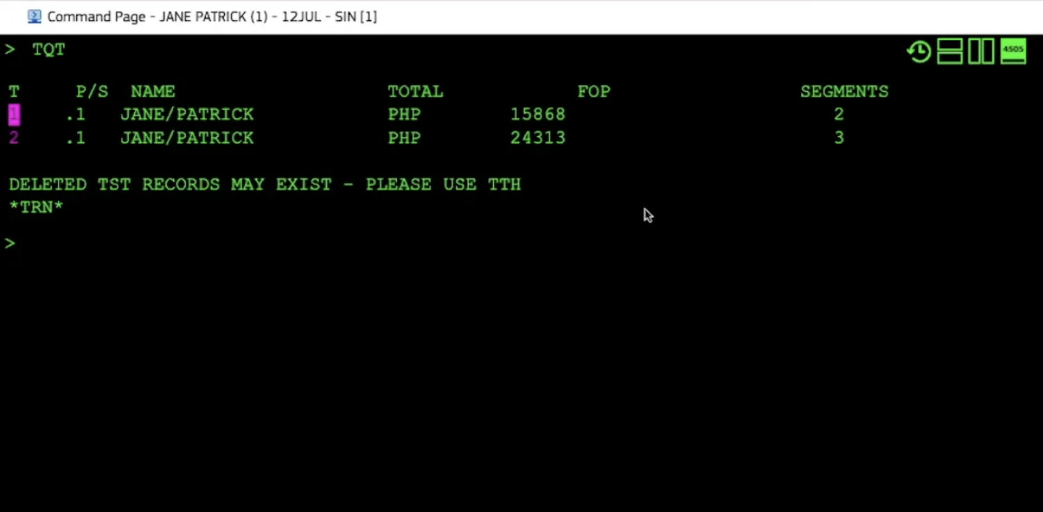
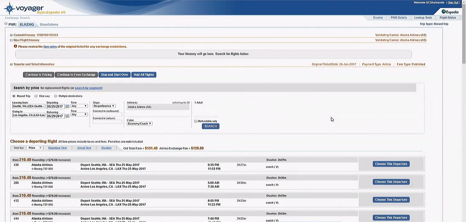
Agents hopped between multiple tools to handle a single scenario — a raw GDS command prompt in one window, the legacy Flights tool in another — making the process inefficient and error-prone.
Project inception with the cross-functional team
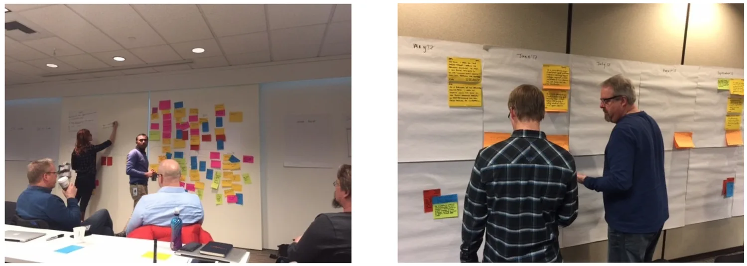
Worked with the PM to list out all the flight-change scenarios, which were complex and spanned across teams and tools. It was a large problem space.
- Partnered with the PM to bring together different teams and stakeholders to understand the system's complexity, identify the roadmap and key workflows, and decide what we wanted to keep from the existing system and what we wanted to change.
- Stakeholders voted and agreed on the high-impact, high-volume scenarios that should be tackled in the given timeframe, which were:
- One-way and round-trip changes for all travelers — ideal for a customer self-serve experience
- Agent-assisted flight changes for fewer than all travelers
- Airline-initiated schedule changes and refunds
Show the right options — and the real price
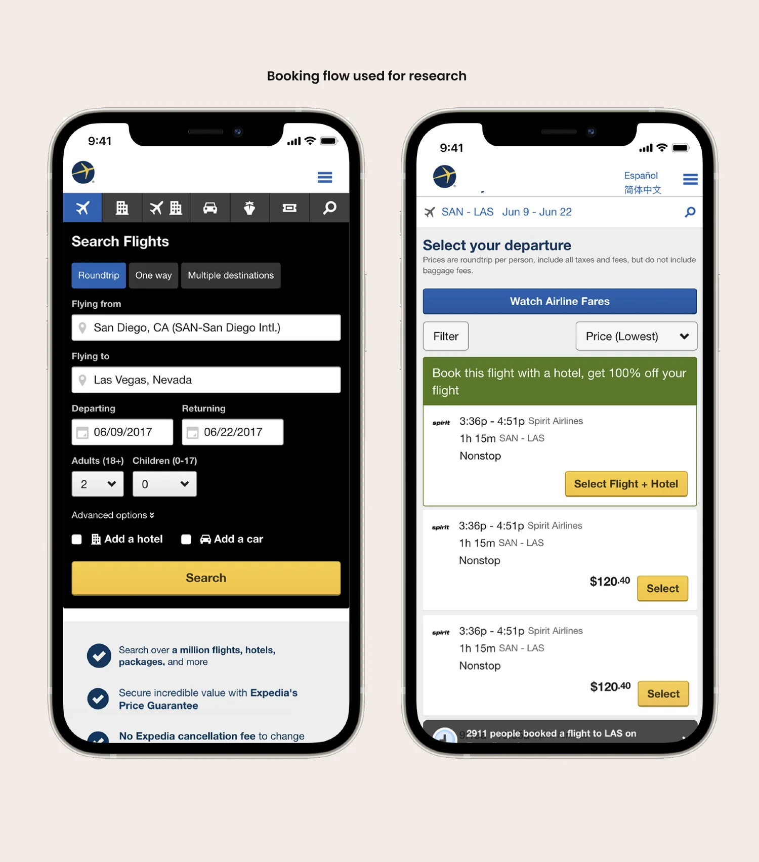
Ineligible options and surprise fees
Free-form search before a call surfaced options the fare rules wouldn't allow, misleading customers. To even assess a selection they had to call — and surprise agent fees and penalties eroded trust.
Surface the right policy information at the right time
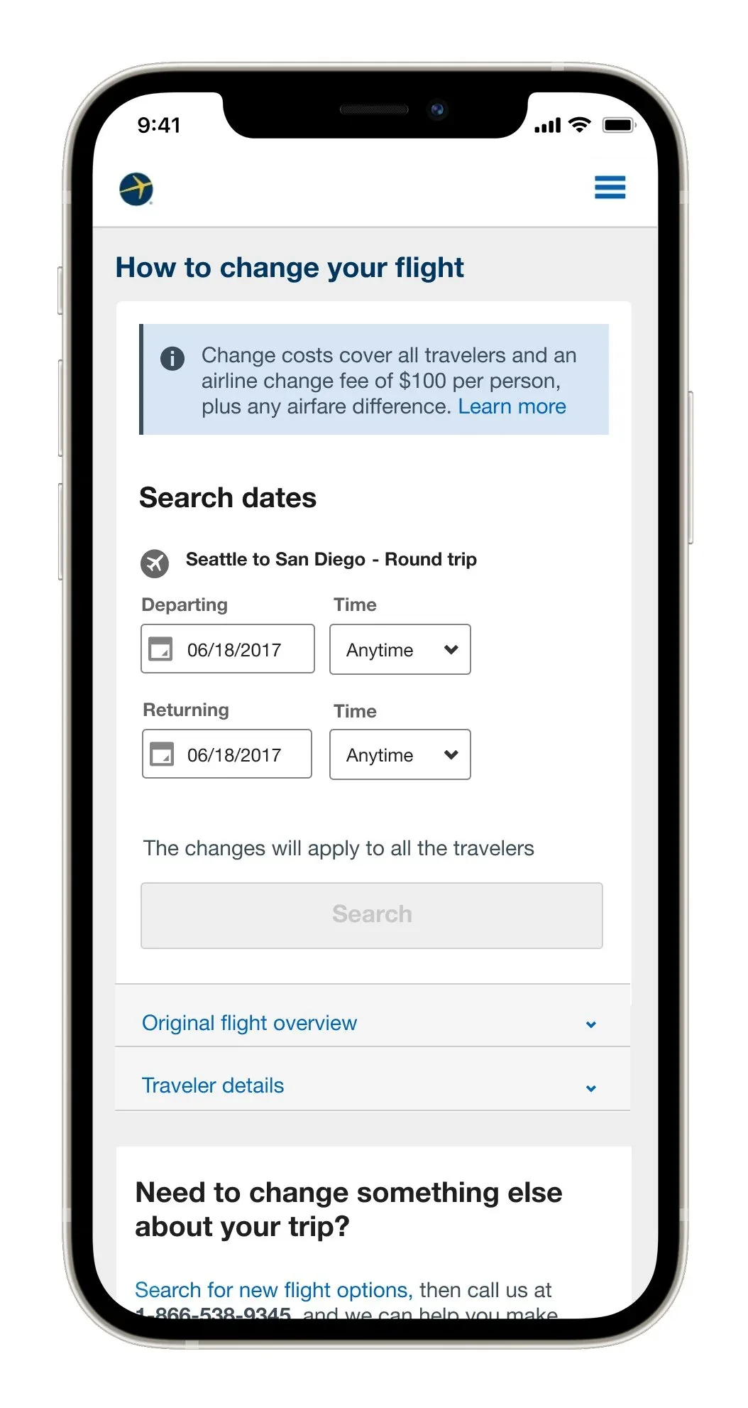
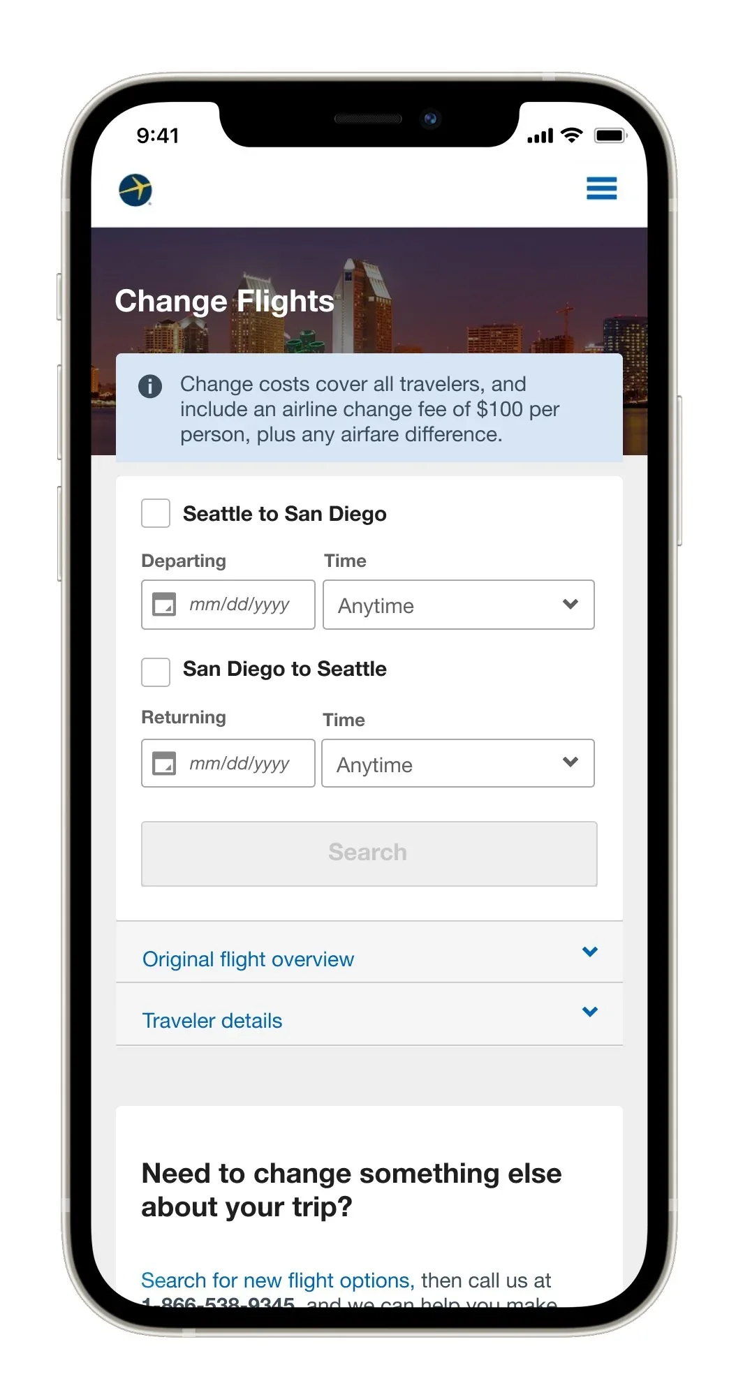
I brought the fare rules forward so customers only saw changes they could actually make. Two iterations tested where the policy note belonged before the final design lifted it into a dedicated airline-policy sheet.
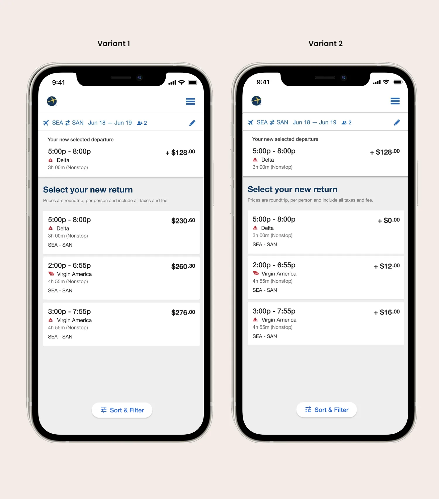
Ran an A/B test to settle how pricing should be displayed
Variant 1 showed the full price of each new flight option, reconciled later against what the traveler had already paid. Variant 2 — the winner — showed only the additional or reduced cost relative to the itinerary they'd already purchased, so the decision needed no mental math.
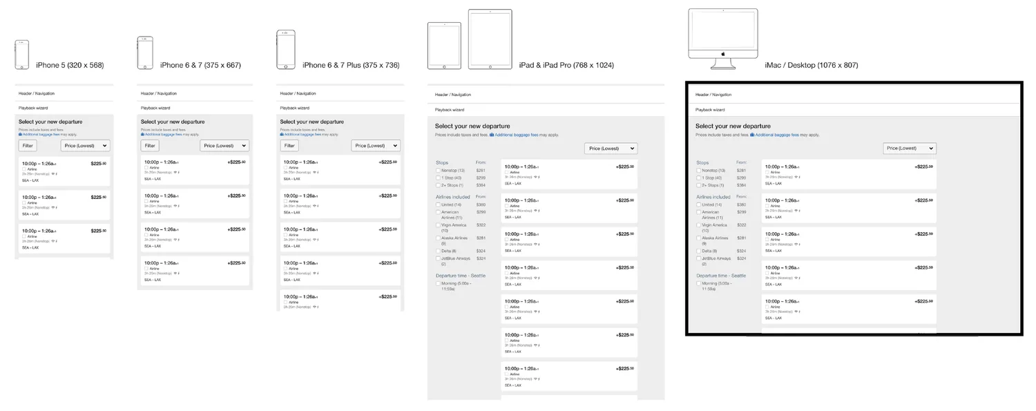
A consistent flight-change experience across devices
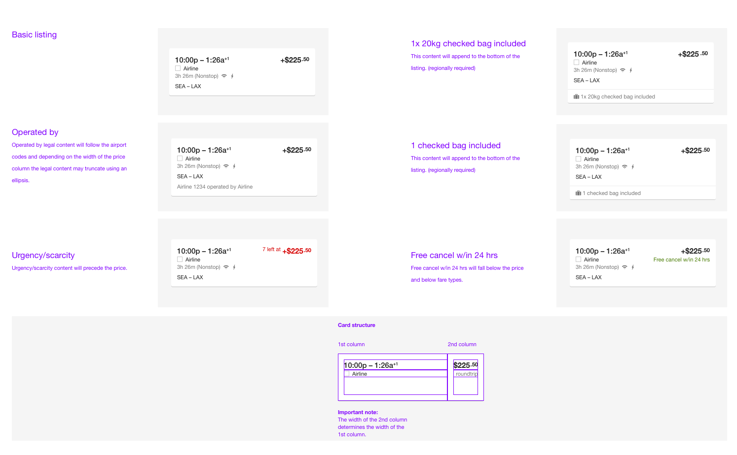
I specified the flow across breakpoints and redlined the flight-listing card — how the price delta, fare types, and legal content behave as the layout narrows — so the experience held together everywhere it shipped.
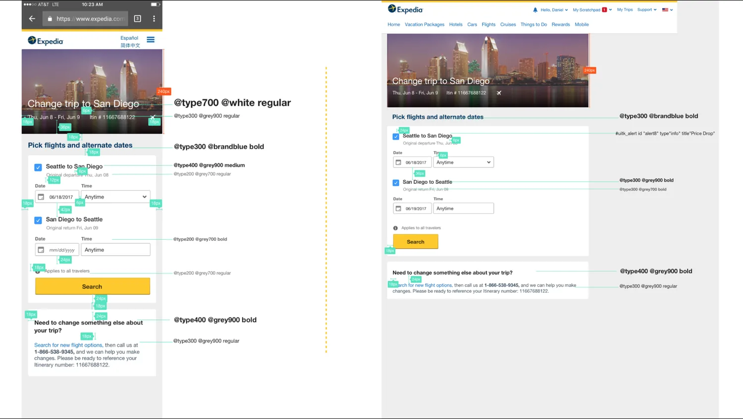
One guided flow, from search to payment
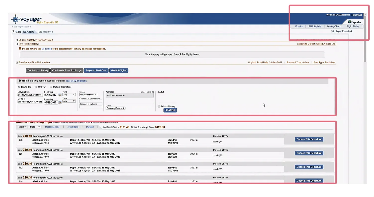
Too many tools, too much clutter
Agents hopped across systems, a deeply nested hierarchy created confusion, and ineligible results led straight to agent errors and airline penalties.
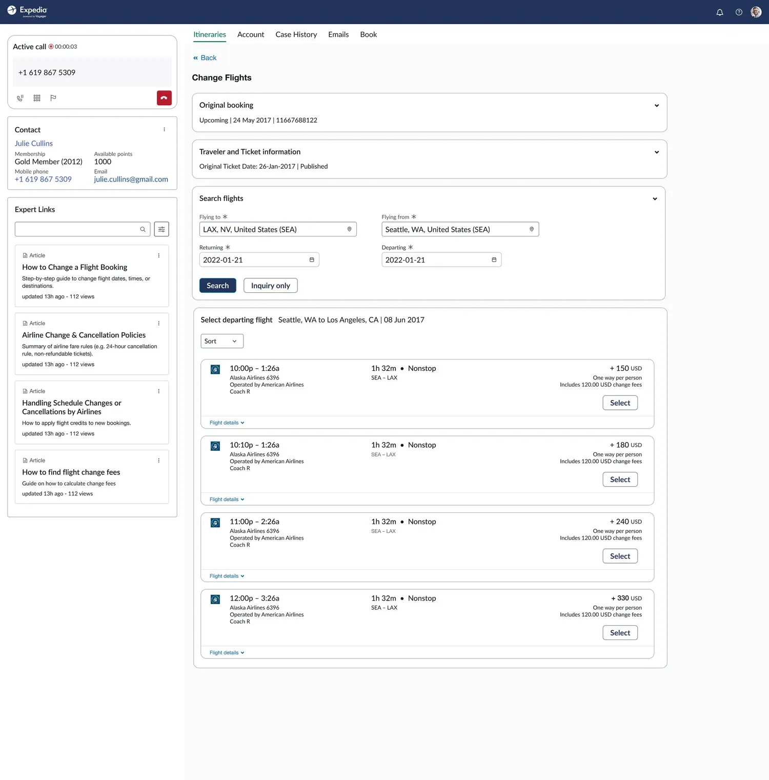
Streamlined, consolidated agent flow
- Designed a guided workflow.
- Showed relevant flights only, with a clear cost difference.
- The existing progress indicator caused usability issues.
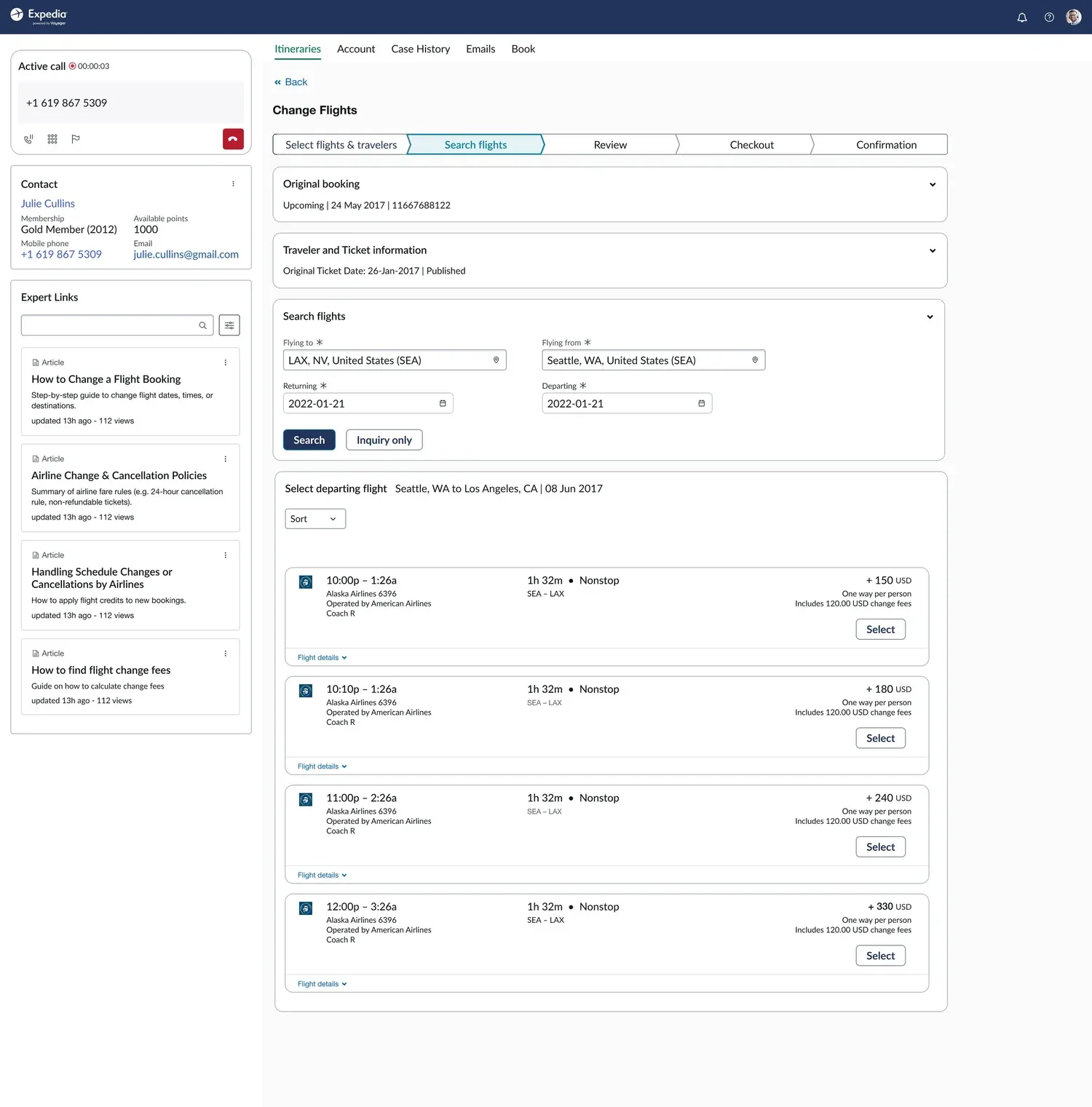
Defined standardized, scalable design patterns
- Designed and iterated on various steppers.
- Worked with the design-system team to finalize it.
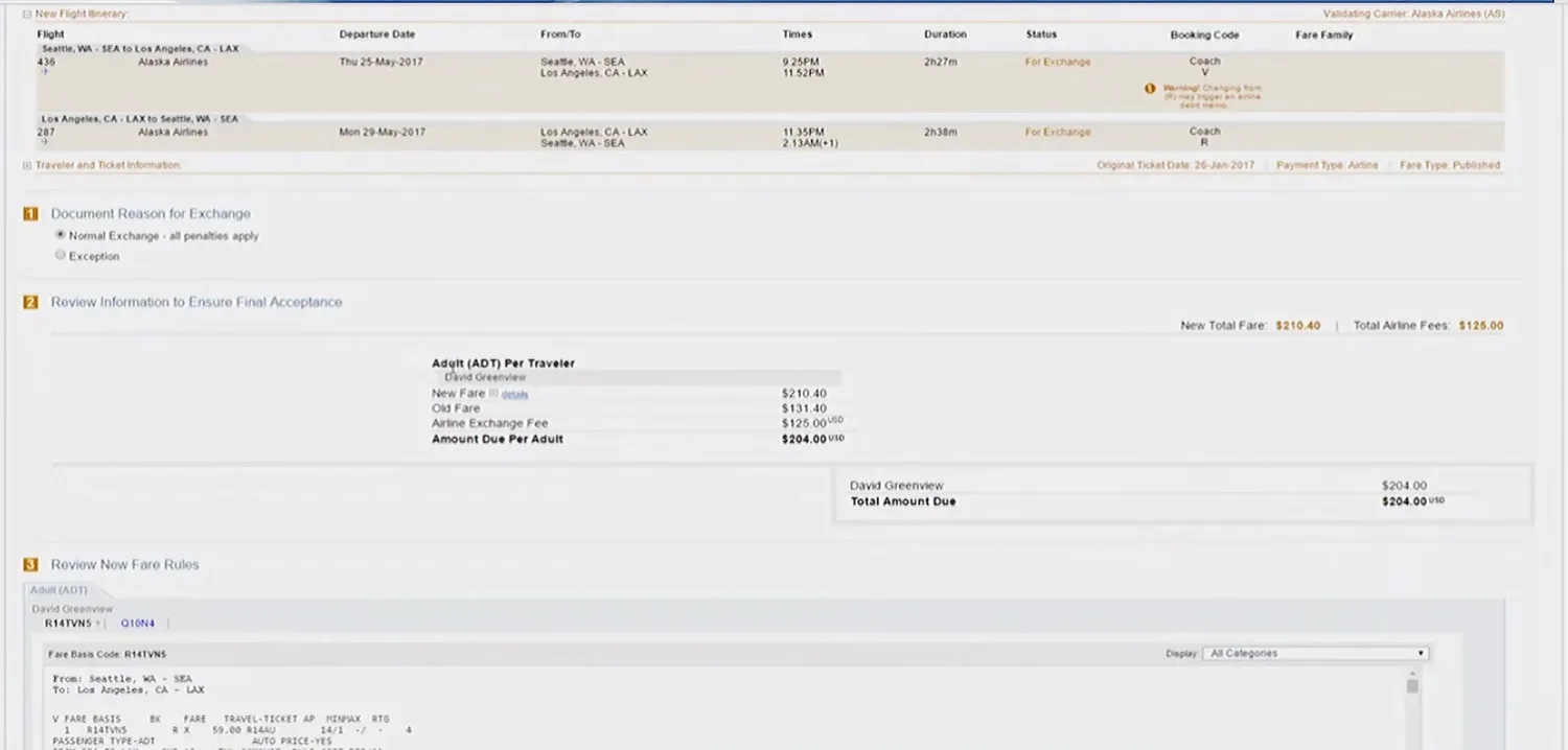
Payment math that hit dead ends late
In the payment step, calculations were unclear, there was no visual hierarchy, and agents hit errors only after they'd invested effort — too late to recover gracefully.
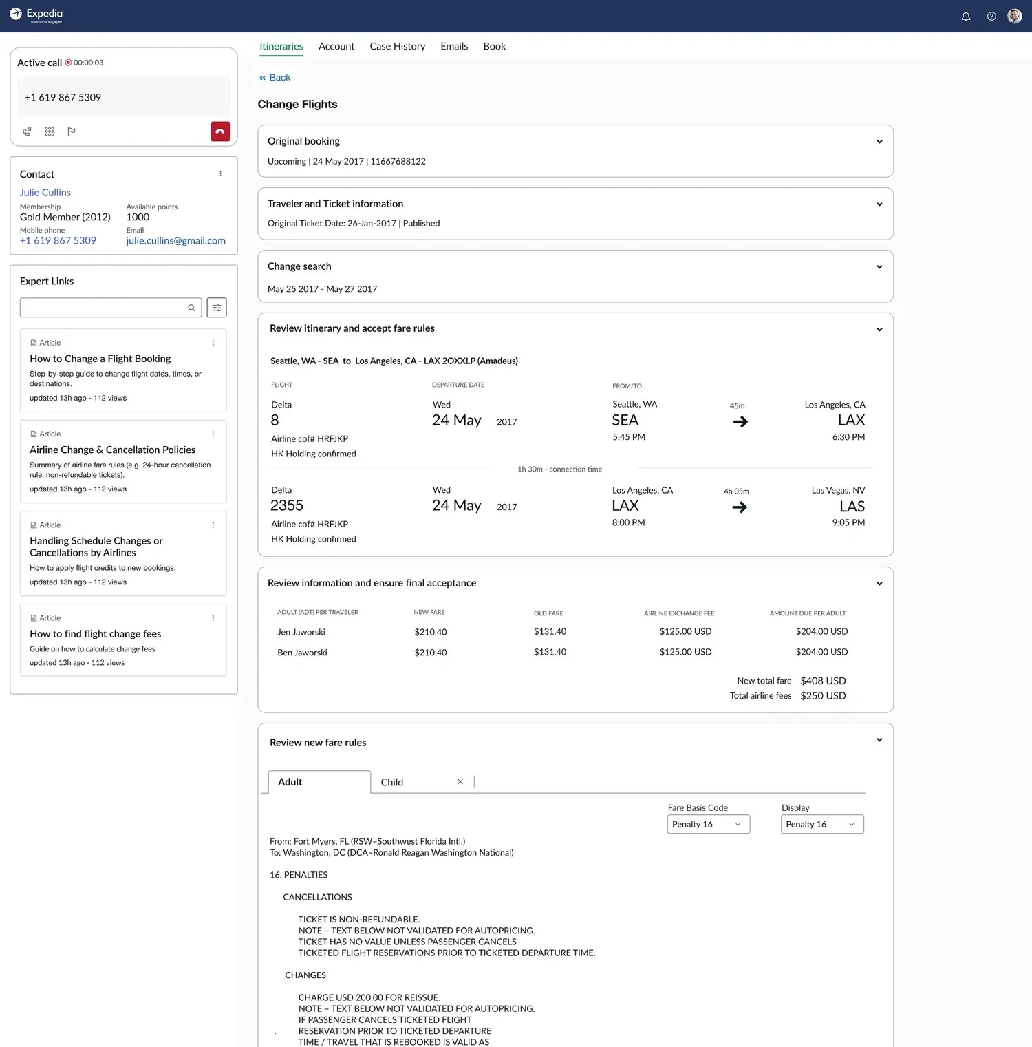
Changed the flow in the Voyager tool
- Simplified the information hierarchy.
- Leveraged the existing design system.
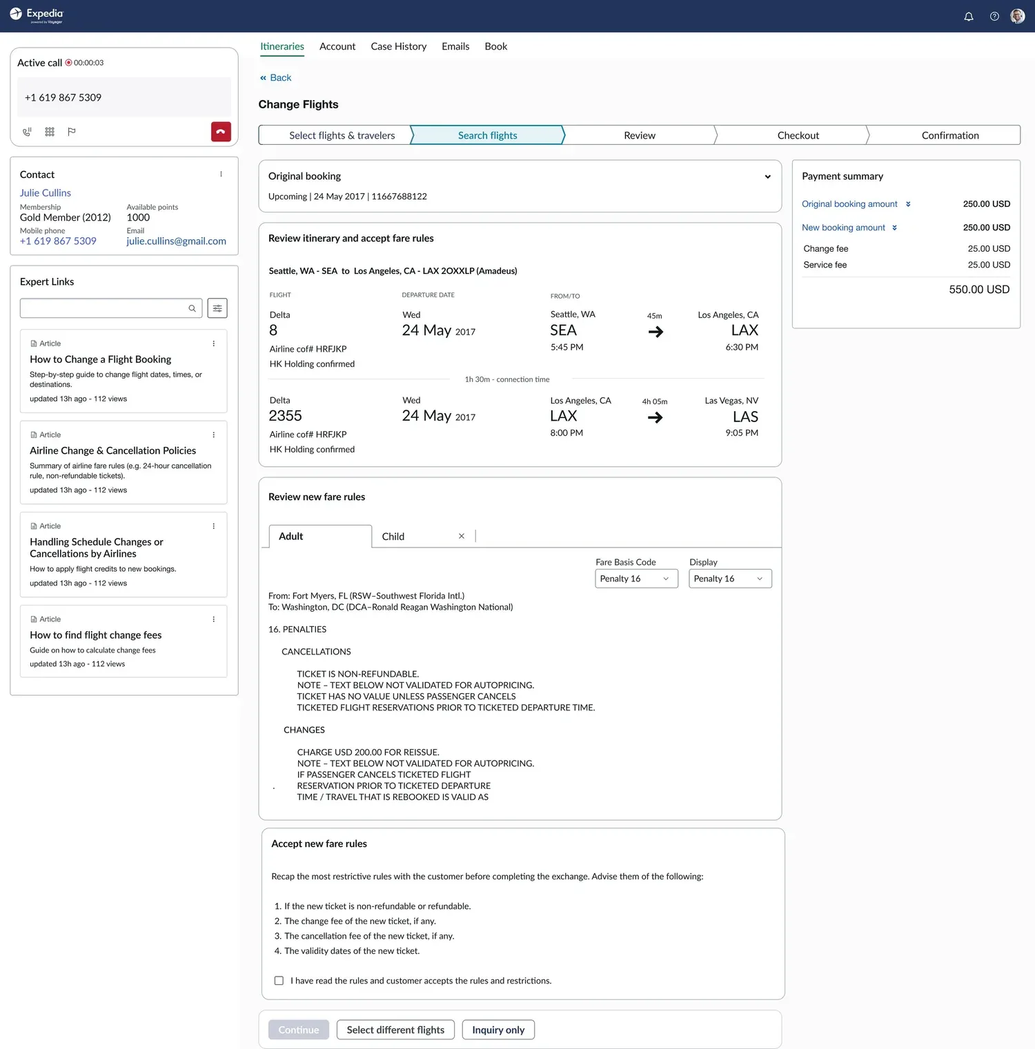
Improved usability with new patterns
- Worked with the design-system team to simplify the payment summary.
- Easy lookup of fare rules.
- A clear amount-due summary.
The end-to-end change, stitched together
I built an interactive prototype to pressure-test the full journey — eligibility, selection, price delta, and payment — with partners across Training, Finance, and Fraud before handing off redlines to engineering.
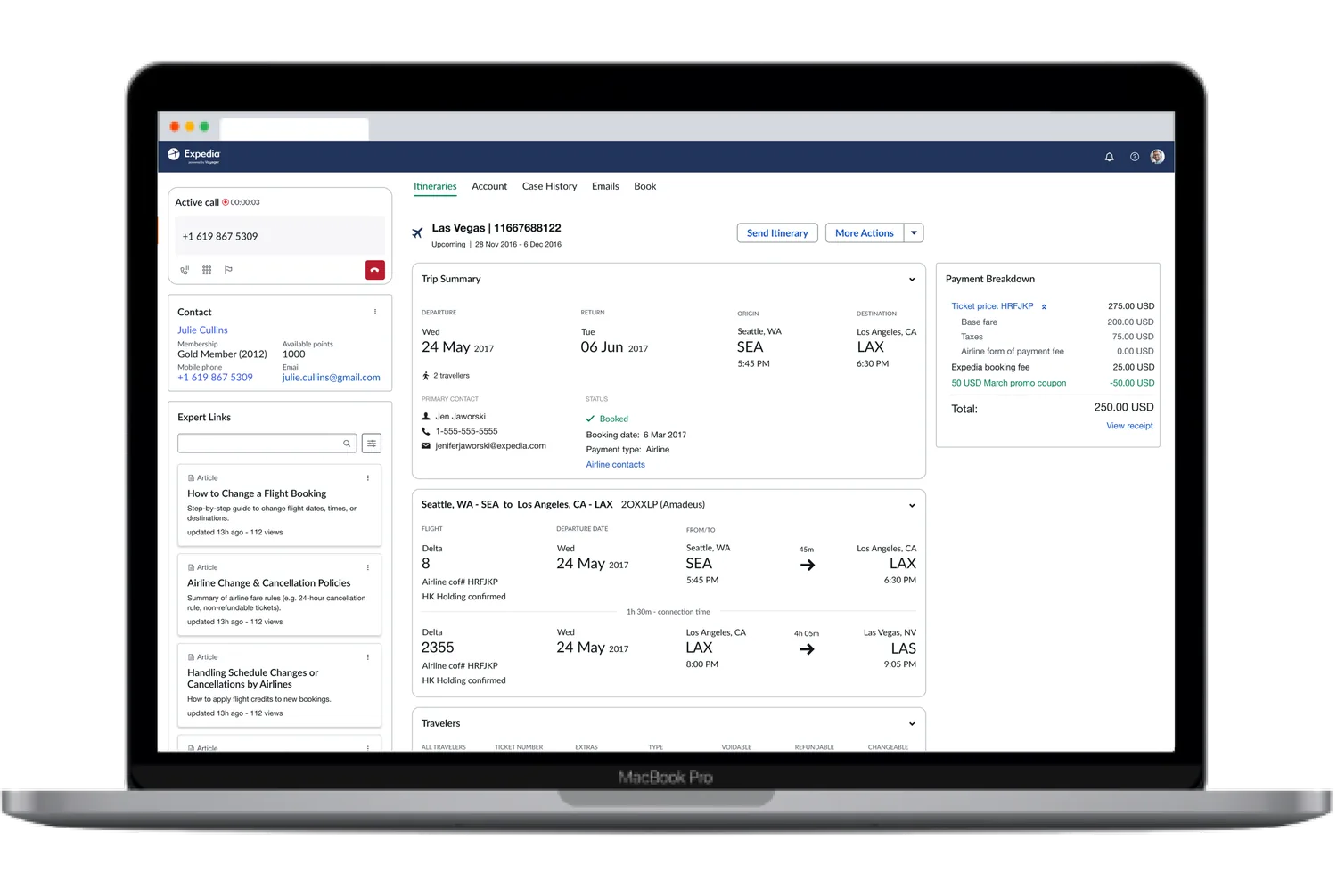
Off the phone, onto the screen
Making the rules visible moved changes to self-service and streamlined the calls that still needed a human — landing $3.9M in annual cost savings and $1.5M in incremental net revenue, on a modern platform with the legacy tool retired.
Collaborate with support first-hand to understand user needs and challenges before designing.
Regular standups and buddy testing with devs enable far better collaboration and fewer surprises.
Complex, policy-heavy flows demand end-to-end orchestration — you can't fix them a screen at a time.